css特效之科幻卡片悬停效果
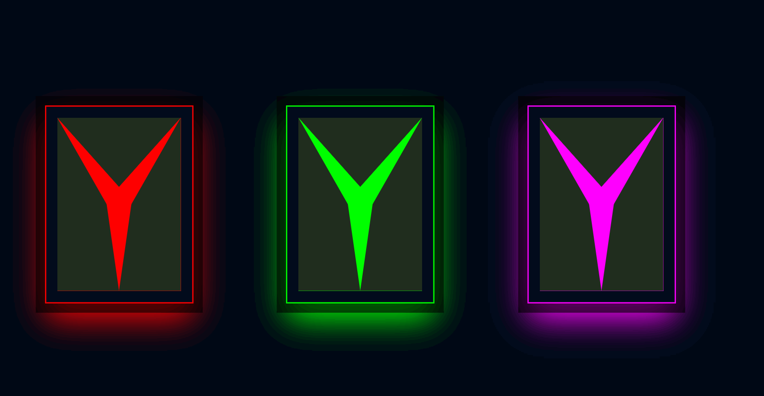 先看效果:HTML代码如下:
<!DOCTYPE html>
<html>
<head>
<meta charset="UTF-8" />
<title>科幻卡片悬停效果</title>
<link rel="stylesheet" href="style.css" />
</head>
... 深入阅读>>
先看效果:HTML代码如下:
<!DOCTYPE html>
<html>
<head>
<meta charset="UTF-8" />
<title>科幻卡片悬停效果</title>
<link rel="stylesheet" href="style.css" />
</head>
... 深入阅读>>
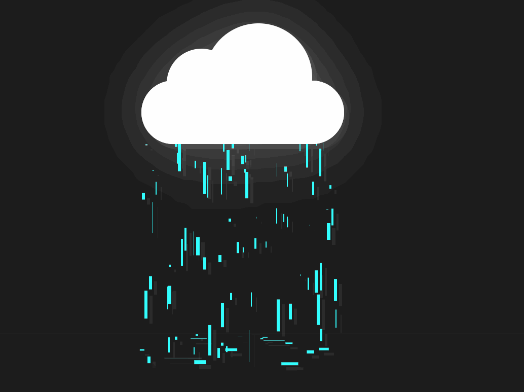 效果:HTML代码:
<!DOCTYPE html>
<html>
<head>
<meta charset="UTF-8" />
<title>CSS云雨效果</title>
<link rel="stylesheet" href="style.css" />
</head>
<... 深入阅读>>
效果:HTML代码:
<!DOCTYPE html>
<html>
<head>
<meta charset="UTF-8" />
<title>CSS云雨效果</title>
<link rel="stylesheet" href="style.css" />
</head>
<... 深入阅读>>
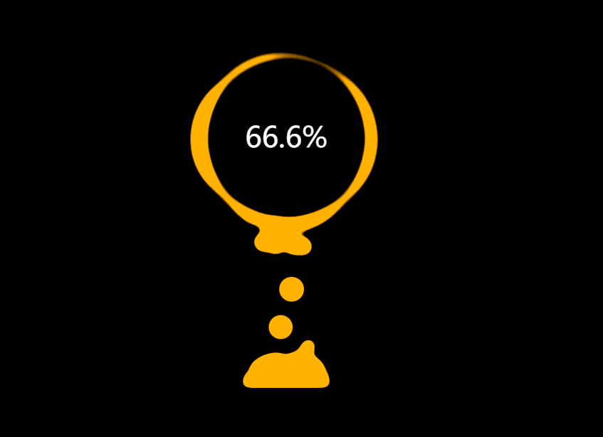
 看效果:THML代码:
<!DOCTYPE html>
<html>
<head>
<meta charset="UTF-8" />
<title>动态数据滚动效果</title>
<link rel="stylesheet" href="style.css" />
</head>
&l... 深入阅读>>
看效果:THML代码:
<!DOCTYPE html>
<html>
<head>
<meta charset="UTF-8" />
<title>动态数据滚动效果</title>
<link rel="stylesheet" href="style.css" />
</head>
&l... 深入阅读>>
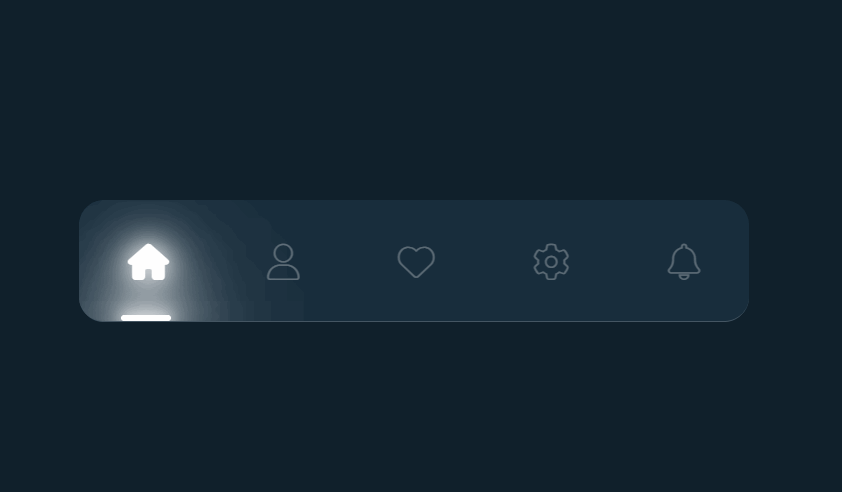 先看看效果:HTML代码:
<!DOCTYPE html>
<html>
<head>
<meta charset="UTF-8" />
<title>CSS带有滑动菜单指示器的导航选项卡</title>
<link rel="stylesheet" href="style.css" />
<l... 深入阅读>>
先看看效果:HTML代码:
<!DOCTYPE html>
<html>
<head>
<meta charset="UTF-8" />
<title>CSS带有滑动菜单指示器的导航选项卡</title>
<link rel="stylesheet" href="style.css" />
<l... 深入阅读>>
 看一下效果:HTML代码:
<!DOCTYPE html>
<html>
<head>
<meta charset="UTF-8" />
<title>手机充电动画</title>
<link rel="stylesheet" href="style.css" />
</head>
&l... 深入阅读>>
看一下效果:HTML代码:
<!DOCTYPE html>
<html>
<head>
<meta charset="UTF-8" />
<title>手机充电动画</title>
<link rel="stylesheet" href="style.css" />
</head>
&l... 深入阅读>>
