css特效之发光边角效果(炫酷、实用)
"
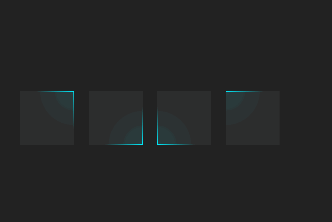
CSS发光边角效果,很炫酷,很实用
HTML代码如下:
<!DOCTYPE html>

<html>

  <head>

    <meta charset=""UTF-8"" />

    <title>CSS发光边角效果</title>

    <link rel=""stylesheet"" href=""style.css"" />

  </head>


  <body>

    <div class=""loader"" style=""--i: 1""></div>

    <div class=""loader"" style=""--i: 2""></div>

    <div class=""loader"" style=""--i: 3""></div>

    <div class=""loader"" style=""--i: 4""></div>

  </body>

</html>
CSS代码如下:
css

* {

  margin: 0;

  padding: 0;

  box-sizing: border-box;

}

body {

  display: flex;

  justify-content: center;

  align-items: center;

  min-height: 100vh;

  background: #222;

  gap: 40px;

}

.loader {

  position: relative;

  width: 150px;

  height: 150px;

  background: rgba(45, 45, 45, 1);

  overflow: hidden;

  transform: rotate(calc(90deg * var(--i)));

}

.loader::before {

  content: """";

  position: absolute;

  width: 300px;

  height: 300px;

  background: radial-gradient(#0ef, transparent, transparent);

  animation: animate 1.5s linear infinite;

}

.loader::after {

  content: """";

  position: absolute;

  inset: 2px;

  background: rgba(45, 45, 45, 0.9);

}

@keyframes animate {

  0% {

    transform: translate(-150px, -150px);

  }

  25% {

    transform: translate(0px, -150px);

  }

  50% {

    transform: translate(0px, 0px);

  }

  75% {

    transform: translate(-150px, 0px);

  }

  100% {

    transform: translate(-150px, -150px);

  }

}
